Color Code Formula
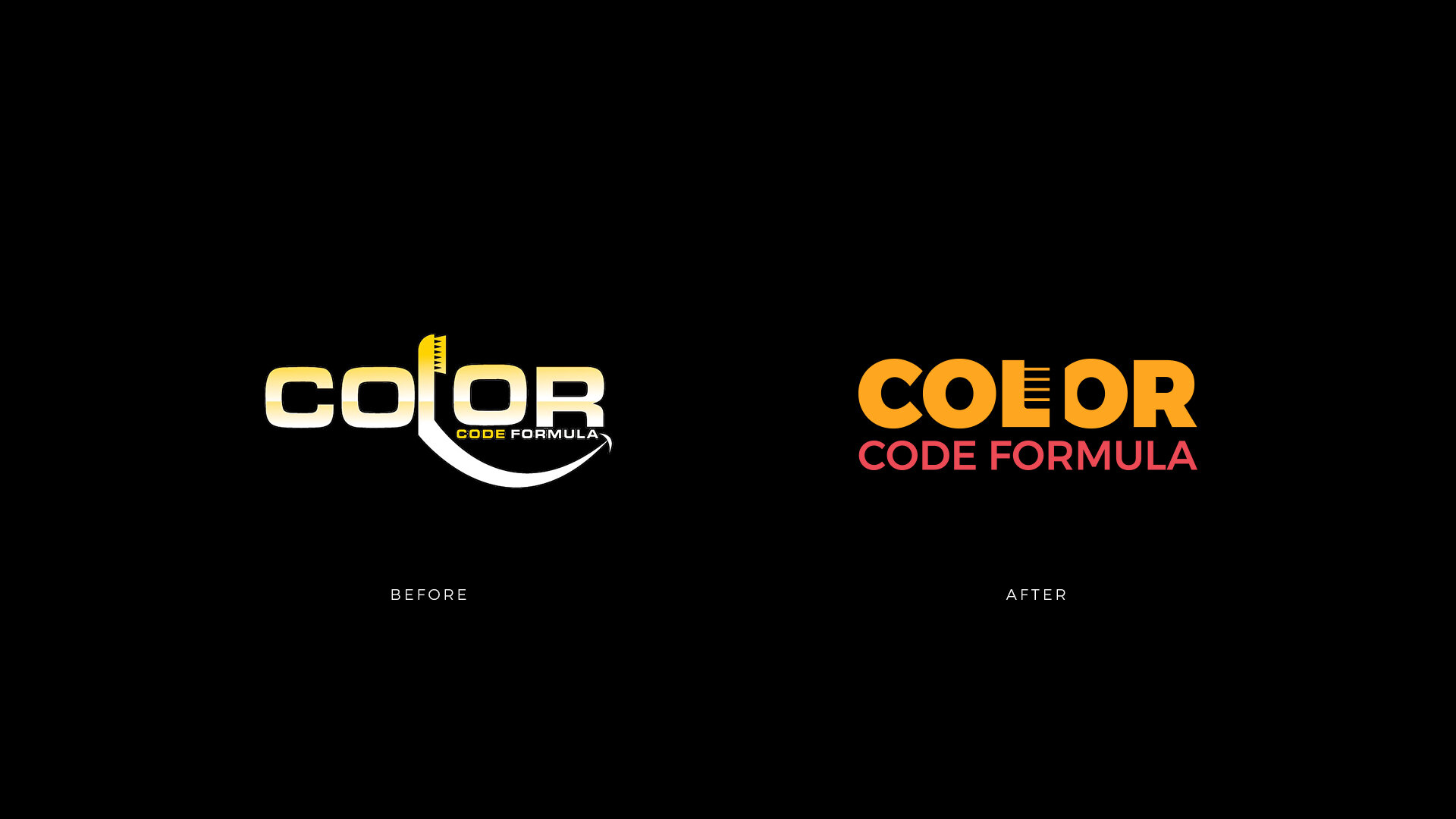
Logo Redesign
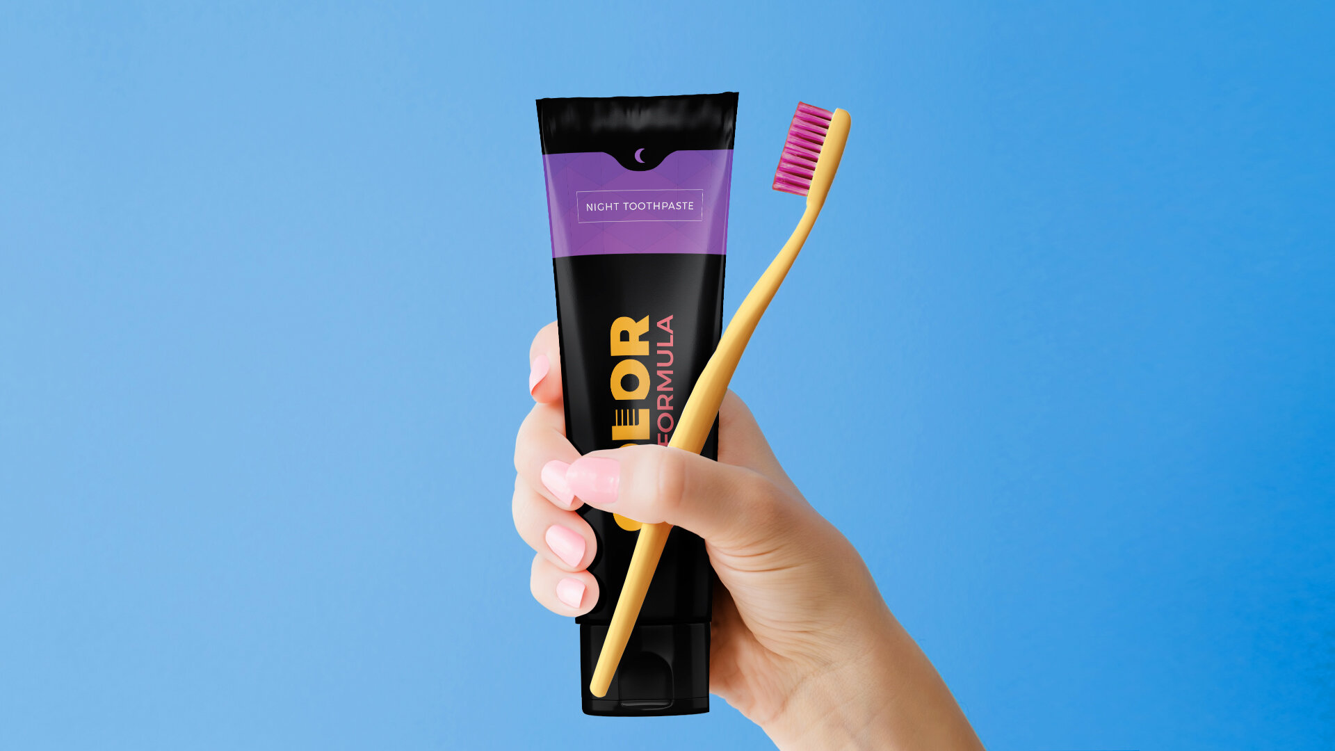
Packaging Redesign
Challenge
The client needed to launch his product to the market and had a brand image that did not convince him. He wanted to focus only on the tube and box packaging. He had no major complaints about his logo as he liked the way the toothbrush was integrated into it.
Outcome
We came along with the proposal to also redesign the logo since it did not work graphically. It had many details and it was going to be very difficult to reproduce with those gradients. On the other hand, the logo had a lot of presence in the packaging and was key to the design. Since the client liked the toothbrush, it was included in the new design but in a more subtle way. The size of "CODE FORMULA" was enlarged since it was almost unreadable and the brand name seemed to be only "COLOR”.The color of both SKU were unified, using black as a base to give them a high-end character. In this way, if new varieties come out tomorrow, the adaptation will be much easier and the brand architecture will not be weakened.